••
Menu
CodingVox
CodingVox
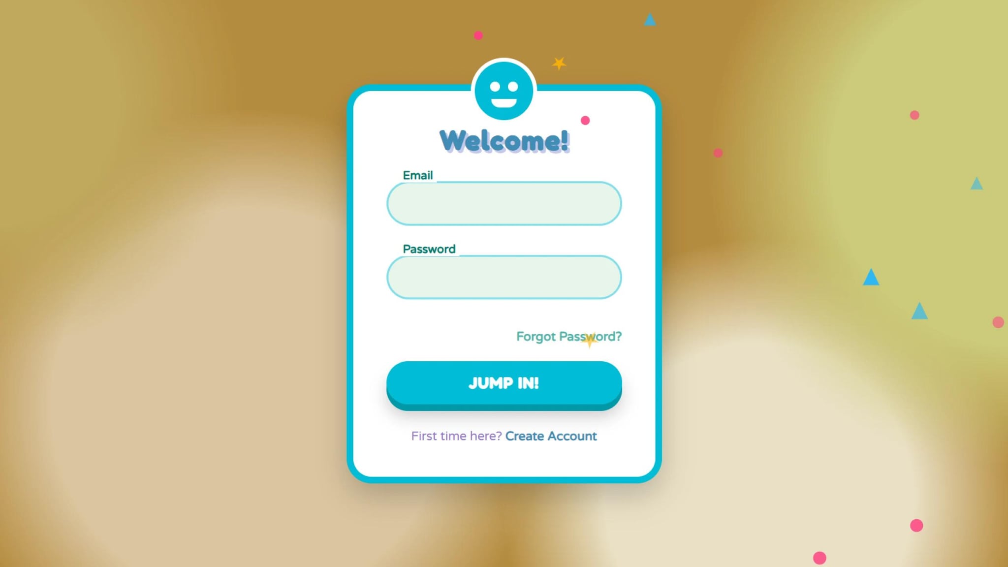
A login form is the first interaction many users have with your website, so why not make it fun and engaging? In this tutorial, we will create a cartoonish animated login form using HTML, CSS, and JavaScript. Our login form will include floating shapes, interactive eyes, and a smooth validation system to make the login experience more dynamic and enjoyable.
First, let’s create the basic structure for our login form in index.html.
We use CSS to create the cartoonish feel and animations. Save this in style.css
We use JavaScript to validate input fields, animate bubbles, and add interaction. Save this in script.js.
<!DOCTYPE html><html lang="en"><head><meta charset="UTF-8" /><meta name="viewport" content="width=device-width, initial-scale=1.0" /><title>Cartoonish Animated Login</title><link rel="stylesheet" href="style.css" /></head><body><div class="login-container"><div class="character"><div class="face"><div class="eyes"><div class="eye"></div><div class="eye"></div></div><div class="mouth"></div></div></div><h2>Welcome!</h2><form id="loginForm"><div class="form-group" id="emailGroup"><input type="text" id="email" /><label for="email">Email</label><div class="validation-message">Oops! That email doesn't look right</div></div><div class="form-group" id="passwordGroup"><input type="password" id="password" /><label for="password">Password</label><div class="validation-message">Password needs at least 6 characters</div></div><div class="forgot-password"><a href="#">Forgot Password?</a></div><button type="submit" id="loginButton">JUMP IN!</button></form><div class="register-link">First time here? <a href="#">Create Account</a></div><div class="success-container" id="success"><div class="checkmark"><div class="smile"></div></div><h3>Woohoo!</h3><p>You're in! Teleporting to your dashboard...</p></div></div><script src="script.js"></script></body></html>
@import url("https://fonts.googleapis.com/css2?family=Fredoka+One&family=Varela+Round&display=swap");* {margin: 0;padding: 0;box-sizing: border-box;font-family: "Varela Round", sans-serif;}body {display: flex;justify-content: center;align-items: center;min-height: 100vh;background: #b58c3f;overflow: hidden;background-image: radial-gradient(circle at 10% 20%,#c0a75c 10%,transparent 20%),radial-gradient(circle at 90% 30%, #cbca79 15%, transparent 25%),radial-gradient(circle at 30% 70%, #dac59f 20%, transparent 30%),radial-gradient(circle at 70% 85%, #e9e0c5 15%, transparent 25%);}.login-container {position: relative;width: 380px;background: #fff;border-radius: 30px;padding: 40px;box-shadow: 0 15px 35px rgba(0, 0, 0, 0.2);transform: scale(0.8) translateY(50px) rotate(-3deg);opacity: 0;animation: popIn 0.7s forwards cubic-bezier(0.175, 0.885, 0.32, 1.275);border: 8px solid #00bcd4;}@keyframes popIn {40% {opacity: 1;transform: scale(1.05) translateY(-10px) rotate(2deg);}60% {transform: scale(0.97) translateY(5px) rotate(-1deg);}80% {transform: scale(1.02) translateY(-3px) rotate(0.5deg);}100% {opacity: 1;transform: scale(1) translateY(0) rotate(0);}}.character {position: absolute;width: 80px;height: 80px;background: #00bcd4;border-radius: 50%;top: -40px;left: 50%;transform: translateX(-50%);border: 5px solid #fff;overflow: hidden;animation: bounce 3s infinite;}@keyframes bounce {0%,100% {transform: translateX(-50%) translateY(0);}50% {transform: translateX(-50%) translateY(-15px);}}.character .face {position: relative;height: 100%;display: flex;justify-content: center;align-items: center;}.character .eyes {display: flex;position: relative;top: -5px;}.character .eye {width: 12px;height: 12px;background: #fff;border-radius: 50%;margin: 0 5px;position: relative;animation: blink 4s infinite;}@keyframes blink {0%,97%,100% {transform: scaleY(1);}98%,99% {transform: scaleY(0.1);}}.character .mouth {position: absolute;width: 30px;height: 10px;background: #fff;border-radius: 0 0 15px 15px;top: 45px;animation: talk 2s infinite;}@keyframes talk {0%,100% {height: 10px;}50% {height: 15px;}}.login-container h2 {text-align: center;color: #3f8cb5;margin-bottom: 30px;font-weight: 600;letter-spacing: 1px;font-size: 2em;font-family: "Fredoka One", cursive;text-shadow: 3px 3px 0 #c5cae9;}.form-group {position: relative;margin-bottom: 35px;}.form-group input {width: 100%;padding: 15px 20px;background: #e8f5e9;border: 3px solid #80deea;outline: none;border-radius: 50px;font-size: 16px;color: #00796b;transition: all 0.3s;transform-origin: left;}.form-group input:focus {border-color: #00bcd4;box-shadow: 0 0 15px rgba(0, 188, 212, 0.3);animation: wiggle 0.5s;}@keyframes wiggle {0%,100% {transform: translateX(0);}25% {transform: translateX(-8px);}50% {transform: translateX(8px);}75% {transform: translateX(-4px);}}.form-group label {position: absolute;left: 25px;top: 15px;font-size: 16px;color: #4db6ac;pointer-events: none;transition: all 0.3s cubic-bezier(0.68, -0.55, 0.265, 1.55);padding: 0 5px;background: transparent;}.form-group input:focus ~ label,.form-group input:valid ~ label {top: -15px;left: 15px;font-size: 14px;color: #00796b;background: #fff;font-weight: bold;}.form-group .validation-message {position: absolute;bottom: -25px;left: 15px;font-size: 13px;color: #ff5252;max-height: 0;overflow: hidden;transition: max-height 0.3s ease-out;}.form-group.error input {border: 3px solid #ff5252;animation: shake 0.5s;}@keyframes shake {0%,100% {transform: translateX(0);}20%,60% {transform: translateX(-10px);}40%,80% {transform: translateX(10px);}}.form-group.error .validation-message {max-height: 25px;}.forgot-password {text-align: right;margin-bottom: 20px;}.forgot-password a {color: #4db6ac;text-decoration: none;font-size: 15px;transition: color 0.3s;font-weight: bold;}.forgot-password a:hover {color: #00796b;transform: scale(1.05);display: inline-block;}button {width: 100%;padding: 15px;background: #00bcd4;border: none;border-radius: 50px;color: #fff;font-size: 18px;font-weight: 600;cursor: pointer;transition: all 0.3s;position: relative;overflow: hidden;box-shadow: 0 8px 0 #0097a7, 0 15px 20px rgba(0, 0, 0, 0.2);font-family: "Fredoka One", cursive;letter-spacing: 1px;}button:hover {transform: translateY(-3px);}button:active {transform: translateY(5px);box-shadow: 0 3px 0 #8a3fb5, 0 5px 10px rgba(0, 0, 0, 0.2);}button .ripple {position: absolute;background: rgba(255, 255, 255, 0.5);border-radius: 50%;transform: scale(0);animation: ripple 0.6s linear;}@keyframes ripple {to {transform: scale(4);opacity: 0;}}.register-link {text-align: center;margin-top: 30px;color: #9575cd;font-size: 15px;}.register-link a {color: #3f8cb5;text-decoration: none;font-weight: 600;transition: all 0.3s;}.register-link a:hover {text-decoration: underline;transform: scale(1.05);display: inline-block;}.success-container {position: absolute;width: 100%;height: 100%;background: #3f8cb5;top: 0;left: 0;border-radius: 22px;display: flex;flex-direction: column;justify-content: center;align-items: center;opacity: 0;transform: scale(0.8) rotate(-10deg);pointer-events: none;transition: all 0.5s;}.success-container.active {opacity: 1;transform: scale(1) rotate(0);pointer-events: all;animation: successPop 0.6s cubic-bezier(0.175, 0.885, 0.32, 1.275);}@keyframes successPop {0% {transform: scale(0.8) rotate(-10deg);}50% {transform: scale(1.1) rotate(5deg);}100% {transform: scale(1) rotate(0);}}.success-container .checkmark {width: 80px;height: 80px;background: #fff;border-radius: 50%;margin-bottom: 20px;position: relative;animation: bounceIn 0.6s forwards, float 2s infinite ease-in-out 0.6s;}@keyframes bounceIn {0% {transform: scale(0);}60% {transform: scale(1.2);}100% {transform: scale(1);}}@keyframes float {0%,100% {transform: translateY(0);}50% {transform: translateY(-15px);}}.success-container .checkmark:before,.success-container .checkmark:after {content: "";position: absolute;background: #6200ea;border-radius: 50%;}.success-container .checkmark:before {width: 12px;height: 12px;top: 25px;left: 22px;}.success-container .checkmark:after {width: 12px;height: 12px;top: 25px;right: 22px;}.success-container .smile {position: absolute;width: 40px;height: 20px;border-radius: 0 0 20px 20px;background: #6200ea;bottom: 20px;left: 50%;transform: translateX(-50%);}.success-container h3 {color: #fff;font-size: 28px;margin-bottom: 10px;font-family: "Fredoka One", cursive;text-shadow: 2px 2px 0 #3700b3;}.success-container p {color: rgba(255, 255, 255, 0.9);text-align: center;}.bubble {position: absolute;background: rgba(255, 255, 255, 0.2);border-radius: 50%;pointer-events: none;}@keyframes floatBubble {0% {transform: translateY(0) scale(1);}100% {transform: translateY(-1000px) scale(0);}}/* Stars/shapes floating around */.shape {position: absolute;pointer-events: none;animation: spin linear infinite;}.shape.star {display: block;width: 0px;height: 0px;border-right: 10px solid transparent;border-bottom: 7px solid #ffb300;border-left: 10px solid transparent;transform: rotate(35deg);}.shape.star:before {border-bottom: 8px solid #ffb300;border-left: 3px solid transparent;border-right: 3px solid transparent;position: absolute;height: 0;width: 0;top: -5px;left: -6px;display: block;content: "";transform: rotate(-35deg);}.shape.star:after {position: absolute;display: block;color: #ffb300;top: 0px;left: -10px;width: 0px;height: 0px;border-right: 10px solid transparent;border-bottom: 7px solid #ffb300;border-left: 10px solid transparent;transform: rotate(-70deg);content: "";}.shape.circle {width: 15px;height: 15px;background: #ff4081;border-radius: 50%;}.shape.triangle {width: 0;height: 0;border-left: 10px solid transparent;border-right: 10px solid transparent;border-bottom: 20px solid #29b6f6;}@keyframes spin {0% {transform: rotate(0deg);}100% {transform: rotate(360deg);}}
function createFloatingShapes() {const shapeTypes = ["star", "circle", "triangle"];const shapeCount = 20;for (let i = 0; i < shapeCount; i++) {const shape = document.createElement("div");const type = shapeTypes[Math.floor(Math.random() * shapeTypes.length)];shape.classList.add("shape");shape.classList.add(type);const posX = Math.random() * 100;const posY = Math.random() * 100;const size = Math.random() * 0.5 + 0.7;const duration = Math.random() * 15 + 10;const delay = Math.random() * 5;shape.style.left = `${posX}%`;shape.style.top = `${posY}%`;shape.style.transform = `scale(${size})`;shape.style.opacity = Math.random() * 0.5 + 0.5;shape.style.animationDuration = `${duration}s`;shape.style.animationDelay = `${delay}s`;document.body.appendChild(shape);}}function createBubbles(x, y) {const bubbleCount = 10;for (let i = 0; i < bubbleCount; i++) {const bubble = document.createElement("div");bubble.classList.add("bubble");const size = Math.random() * 20 + 10;const posX = x + (Math.random() * 100 - 50);const posY = y + (Math.random() * 50 - 25);const speedY = Math.random() * 2 + 1;bubble.style.width = `${size}px`;bubble.style.height = `${size}px`;bubble.style.left = `${posX}px`;bubble.style.top = `${posY}px`;bubble.style.animation = `floatBubble ${speedY}s forwards`;document.body.appendChild(bubble);setTimeout(() => {bubble.remove();}, speedY * 1000);}}const loginForm = document.getElementById("loginForm");const emailInput = document.getElementById("email");const passwordInput = document.getElementById("password");const emailGroup = document.getElementById("emailGroup");const passwordGroup = document.getElementById("passwordGroup");const loginButton = document.getElementById("loginButton");const successContainer = document.getElementById("success");emailInput.addEventListener("blur", () => {validateEmail();});passwordInput.addEventListener("blur", () => {validatePassword();});function validateEmail() {const emailValue = emailInput.value.trim();const emailPattern = /^[^\s@]+@[^\s@]+\.[^\s@]+$/;if (!emailPattern.test(emailValue) && emailValue !== "") {emailGroup.classList.add("error");return false;} else {emailGroup.classList.remove("error");return true;}}function validatePassword() {const passwordValue = passwordInput.value.trim();if (passwordValue.length < 6 && passwordValue !== "") {passwordGroup.classList.add("error");return false;} else {passwordGroup.classList.remove("error");return true;}}loginButton.addEventListener("mousedown", (e) => {const x = e.clientX - e.target.getBoundingClientRect().left;const y = e.clientY - e.target.getBoundingClientRect().top;const ripple = document.createElement("span");ripple.classList.add("ripple");ripple.style.left = `${x}px`;ripple.style.top = `${y}px`;loginButton.appendChild(ripple);createBubbles(e.clientX, e.clientY);setTimeout(() => {ripple.remove();}, 600);});loginForm.addEventListener("submit", (e) => {e.preventDefault();const isEmailValid = validateEmail();const isPasswordValid = validatePassword();if (isEmailValid &&isPasswordValid &&emailInput.value.trim() !== "" &&passwordInput.value.trim() !== "") {loginButton.disabled = true;loginButton.innerHTML = "WOOOSH!";const buttonRect = loginButton.getBoundingClientRect();const buttonCenterX = buttonRect.left + buttonRect.width / 2;const buttonCenterY = buttonRect.top + buttonRect.height / 2;for (let i = 0; i < 5; i++) {setTimeout(() => {createBubbles(buttonCenterX, buttonCenterY);}, i * 200);}setTimeout(() => {successContainer.classList.add("active");setTimeout(() => {loginButton.innerHTML = "JUMP IN!";loginButton.disabled = false;successContainer.classList.remove("active");loginForm.reset();}, 3000);}, 1500);} else {if (emailInput.value.trim() === "") {emailGroup.classList.add("error");}if (passwordInput.value.trim() === "") {passwordGroup.classList.add("error");}loginForm.style.animation = "shake 0.5s";setTimeout(() => {loginForm.style.animation = "";}, 500);}});createFloatingShapes();
With HTML, CSS, and JavaScript, we have created a cartoonish animated login form that is both engaging and fun. The interactive character, floating animations, and smooth validation create a delightful experience for users. Try experimenting with different animations to make it even more unique!
Do you want to take it further? Add more animations, sound effects, or custom illustrations to make your login page stand out!
Developer
Join 1,000+ developers getting weekly web development tips and code snippets
Found this helpful? Share it with others!