••
Menu
CodingVox
CodingVox
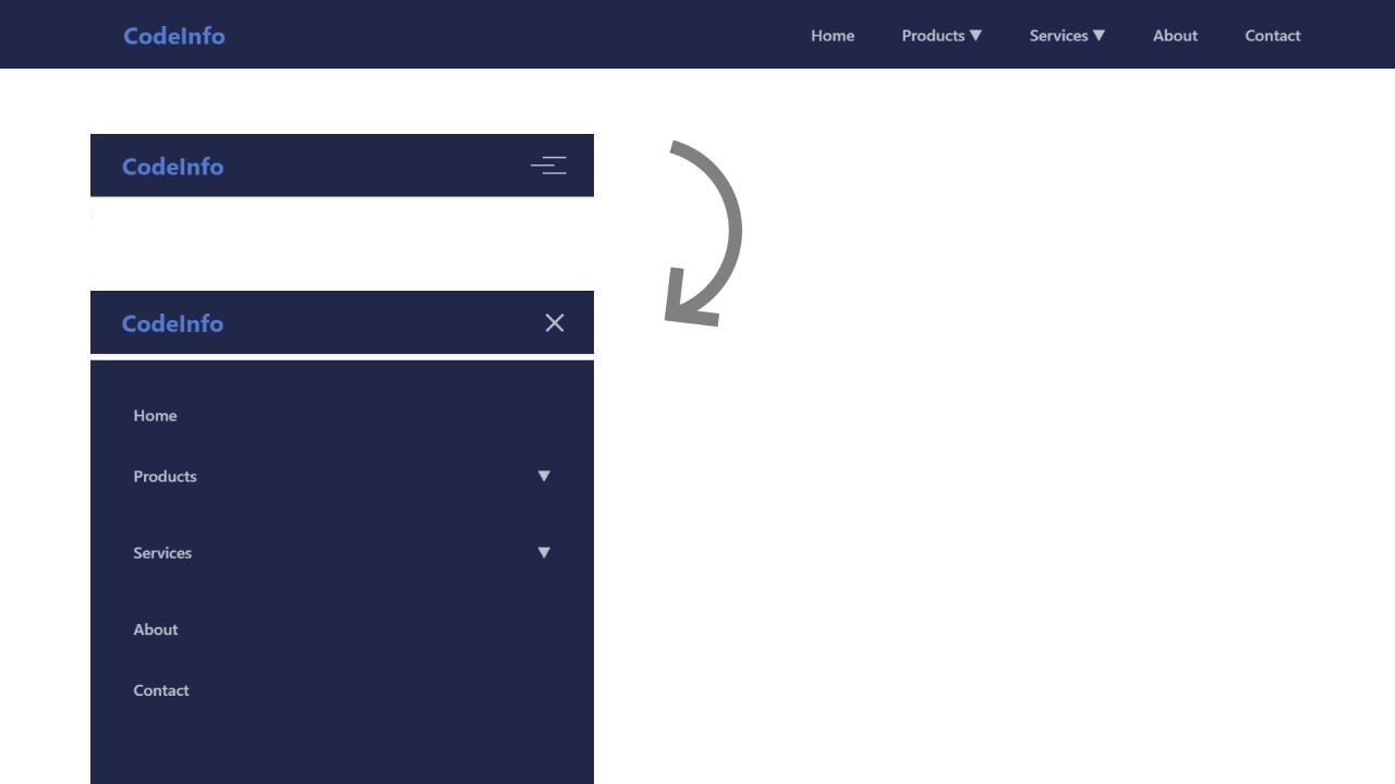
Learn how to build a modern responsive navigation bar with dropdown menus, mobile optimization, and accessibility features. Perfect for web developers and UI designers. Navigation is the backbone of any website's user interface. In this guide, we'll explore how to create a modern, responsive navigation bar that works seamlessly across all devices and screen sizes.
A well-designed navigation bar should include:
The color palette creates a professional, modern look with:
A well-implemented navigation bar is crucial for website usability. This solution provides a solid foundation that can be customized for various projects while maintaining accessibility and performance standards.
Copy the source code provided below and set up your project files accordingly. First, create a file named index.html and paste the HTML code into it. Next, create a file called styles.css and insert the CSS code there. Finally, create a file named script.js and paste the JavaScript code into it. This structure organizes your project into separate files for HTML, CSS, and JavaScript, making it easier to manage and maintain your code.
<!DOCTYPE html><html lang="en"><head><meta charset="UTF-8" /><meta name="viewport" content="width=device-width, initial-scale=1.0" /><title>Responsive Navbar</title></head><body><nav class="navbar"><div class="nav-container"><a href="#" class="logo">CodeInfo</a><button class="hamburger"><span class="hamburger-line"></span></button><ul class="nav-menu"><li class="nav-item"><a href="#" class="nav-link">Home</a></li><li class="nav-item"><a href="#" class="nav-link">Products<span class="arrow">▼</span></a><div class="dropdown"><a href="#" class="dropdown-item">Category 1</a><a href="#" class="dropdown-item">Category 2</a><a href="#" class="dropdown-item">Category 3</a><a href="#" class="dropdown-item">Category 4</a></div></li><li class="nav-item"><a href="#" class="nav-link">Services<span class="arrow">▼</span></a><div class="dropdown"><a href="#" class="dropdown-item">Service 1</a><a href="#" class="dropdown-item">Service 2</a><a href="#" class="dropdown-item">Service 3</a></div></li><li class="nav-item"><a href="#" class="nav-link">About</a></li><li class="nav-item"><a href="#" class="nav-link">Contact</a></li></ul></div></nav></body></html>
* {margin: 0;padding: 0;box-sizing: border-box;font-family: -apple-system, BlinkMacSystemFont, "Segoe UI", Roboto, sans-serif;}:root {--primary-color: #537bd3;--text-color: #bac1cc;--bg-color: rgb(32, 39, 73);--hover-color: #f3f4f6;--dropdown-shadow: 0 4px 6px -1px rgba(0, 0, 0, 0.1),0 2px 4px -1px rgba(0, 0, 0, 0.06);}.navbar {background-color: var(--bg-color);padding: 1rem 2rem;box-shadow: 0 1px 3px rgba(0, 0, 0, 0.1);position: fixed;top: 0;left: 0;right: 0;z-index: 1000;}.nav-container {max-width: 1200px;margin: 0 auto;display: flex;justify-content: space-between;align-items: center;}.logo {font-size: 1.5rem;font-weight: bold;color: var(--primary-color);text-decoration: none;}.nav-menu {display: flex;list-style: none;gap: 2rem;align-items: center;}.nav-item {position: relative;}.nav-link {color: var(--text-color);text-decoration: none;font-size: 1rem;font-weight: 500;padding: 0.5rem;transition: color 0.3s ease;display: flex;align-items: center;gap: 0.25rem;}.nav-link:hover {color: var(--primary-color);}.dropdown {position: absolute;top: 100%;left: 0;background-color: var(--bg-color);border-radius: 0.5rem;box-shadow: var(--dropdown-shadow);min-width: 200px;opacity: 0;visibility: hidden;transform: translateY(10px);transition: all 0.3s ease;padding: 0.5rem 0;}.nav-item:hover .dropdown {opacity: 1;visibility: visible;transform: translateY(0);}.dropdown-item {padding: 0.75rem 1rem;color: var(--text-color);text-decoration: none;display: block;font-size: 0.875rem;transition: background-color 0.3s ease;}.dropdown-item:hover {background-color: var(--hover-color);color: var(--primary-color);}.hamburger {display: none;cursor: pointer;border: none;background: none;padding: 0.5rem;}.hamburger-line {display: block;width: 24px;height: 2px;background-color: var(--text-color);transition: all 0.3s ease;position: relative;}.hamburger-line::before,.hamburger-line::after {content: "";position: absolute;width: 24px;height: 2px;background-color: var(--text-color);transition: all 0.3s ease;}.hamburger-line::before {transform: translateY(-8px);}.hamburger-line::after {transform: translateY(8px);}.hamburger.active .hamburger-line {background-color: transparent;}.hamburger.active .hamburger-line::before {transform: rotate(45deg);}.hamburger.active .hamburger-line::after {transform: rotate(-45deg);}@media (max-width: 768px) {.hamburger {display: block;}.nav-menu {position: fixed;left: -100%;top: 70px;flex-direction: column;background-color: var(--bg-color);width: 100%;height: calc(100vh - 70px);padding: 2rem;transition: left 0.3s ease;gap: 1rem;box-shadow: var(--dropdown-shadow);}.nav-menu.active {left: 0;}.nav-item {width: 100%;}.dropdown {position: static;opacity: 1;visibility: visible;transform: none;box-shadow: none;max-height: 0;overflow: hidden;transition: max-height 0.3s ease;}.nav-item.active .dropdown {max-height: 500px;}.nav-link {justify-content: space-between;padding: 0.75rem;}.arrow {transition: transform 0.3s ease;}.nav-item.active .arrow {transform: rotate(180deg);}}
const hamburger = document.querySelector(".hamburger");const navMenu = document.querySelector(".nav-menu");const navItems = document.querySelectorAll(".nav-item");// Toggle mobile menuhamburger.addEventListener("click", () => {hamburger.classList.toggle("active");navMenu.classList.toggle("active");});// Handle dropdown toggles on mobilenavItems.forEach((item) => {const link = item.querySelector(".nav-link");if (link.querySelector(".arrow")) {link.addEventListener("click", (e) => {if (window.innerWidth <= 768) {e.preventDefault();item.classList.toggle("active");}});}});// Close mobile menu when clicking outsidedocument.addEventListener("click", (e) => {if (!navMenu.contains(e.target) && !hamburger.contains(e.target)) {hamburger.classList.remove("active");navMenu.classList.remove("active");navItems.forEach((item) => item.classList.remove("active"));}});// Handle window resizewindow.addEventListener("resize", () => {if (window.innerWidth > 768) {hamburger.classList.remove("active");navMenu.classList.remove("active");navItems.forEach((item) => item.classList.remove("active"));}});
Developer
Join 1,000+ developers getting weekly web development tips and code snippets
Found this helpful? Share it with others!